About the project
The project involved the concept and development of the Digital Education and Emerging Technologies Portal as part of the e-Universities project, with the aim of bringing together educational resources, tools and content related to the use of digital technologies in education in one place.
The portal is intended for higher education professionals, students and the wider educational and research community. Its concept and structure were designed with a strong focus on clarity, intuitive navigation and knowledge sharing.
Name and tagline
The name DOT was created as an acronym for Digital Education and Technologies, while the word “dot” also symbolises connection and a central point where digital content, tools and knowledge come together.
The name connects technology, learning and the exchange of experiences through simple access to relevant information.
“ Connecting dots. Sharing knowledge.
The tagline highlights the idea of connecting information, people and knowledge within a single digital platform for learning, collaboration and the exchange of experiences.
Identity through form
“ Sometimes design doesn’t start with an idea, but with a rule — geometry, rhythm and a grid.
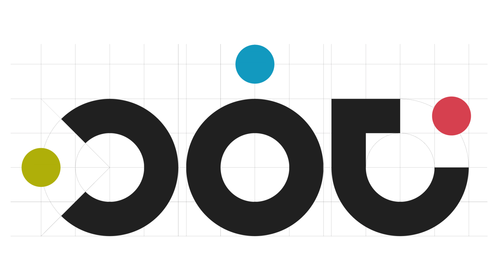
The logo was created from a system of six precisely positioned circles, with the letters D, O and T formed through carefully constructed circular shapes.
The minimalist black form brings clarity, stability and a contemporary feel, while three coloured dots add a sense of dynamism and create a visual connection to CARNET’s identity.
They symbolise connectivity, knowledge sharing and digital communication.
The logo combines technical precision with visual playfulness, allowing it to work equally well across digital and print applications, as well as on both light and dark backgrounds.
Information architecture
Through a series of workshops, we defined the portal structure, content organisation and navigation logic to create a clear and intuitive user experience.
Particular attention was given to clarity, understandable category naming and a structure that could support future content growth.
Wireframes
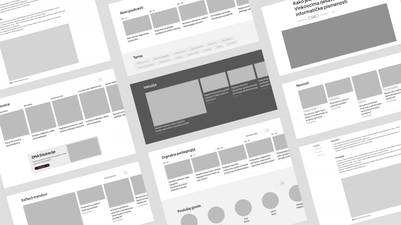
Once the structure was defined, we created wireframes for different page types.
They allowed us to establish the layout, content hierarchy, navigation and key functionalities before moving into the visual design phase.
Content guidelines
In parallel, we developed the initial content and content guidelines for the portal.
We defined the tone of voice, writing principles and editorial approach to ensure that content remained consistent, clear and adaptable across different types of publications.
Design system
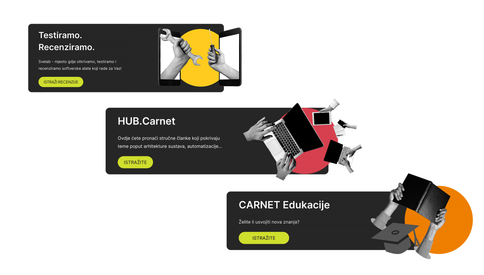
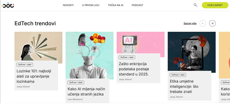
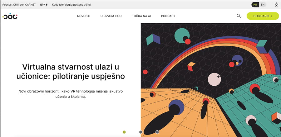
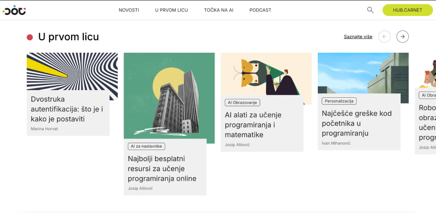
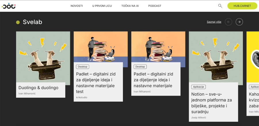
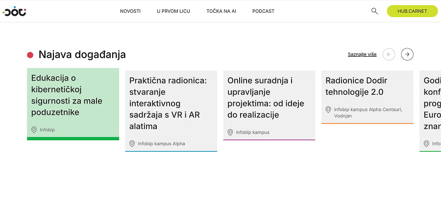
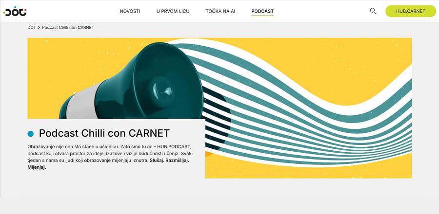
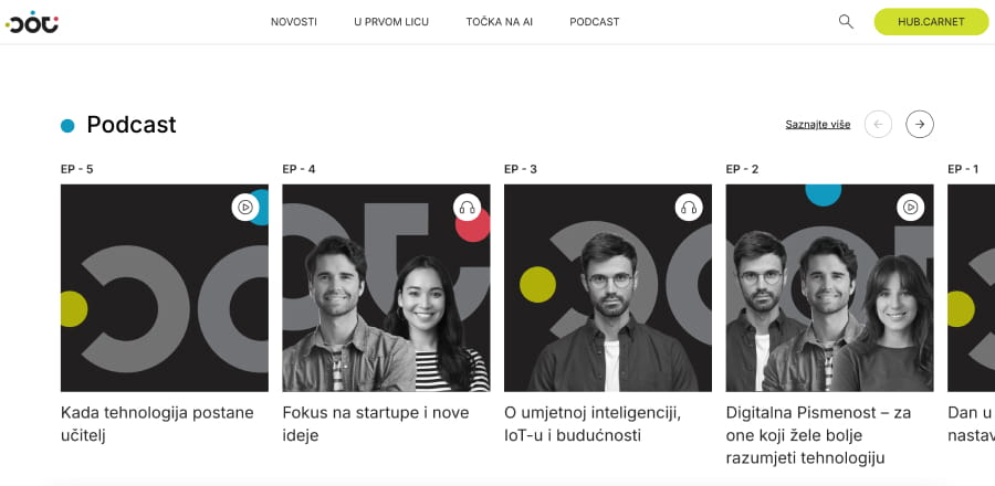
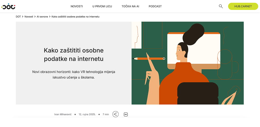
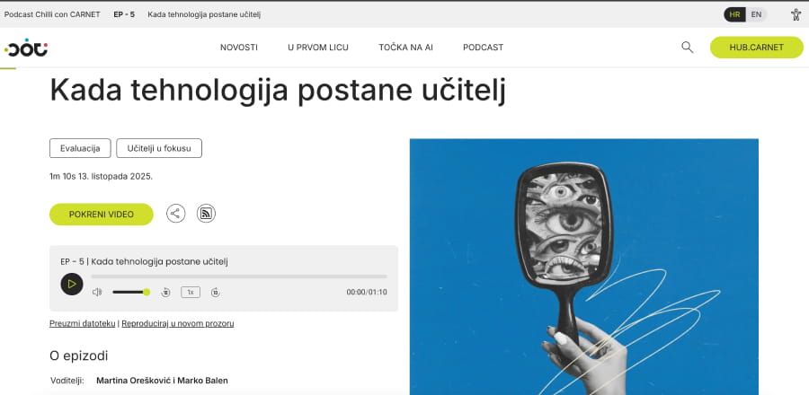
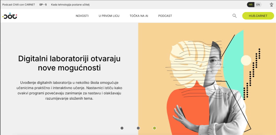
Following the wireframing phase, we developed the visual direction and created mockups for the key page types: the homepage, category pages, news listings, static pages and the podcast section.
The focus was on creating a system capable of supporting a large variety of content while remaining clear, structured and easy to use.
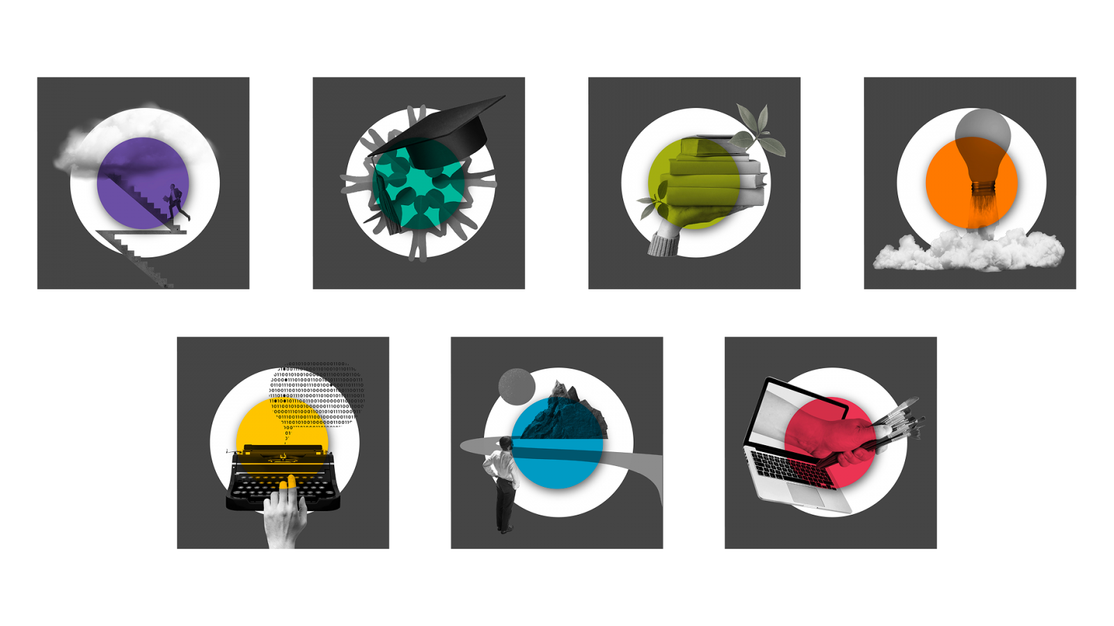
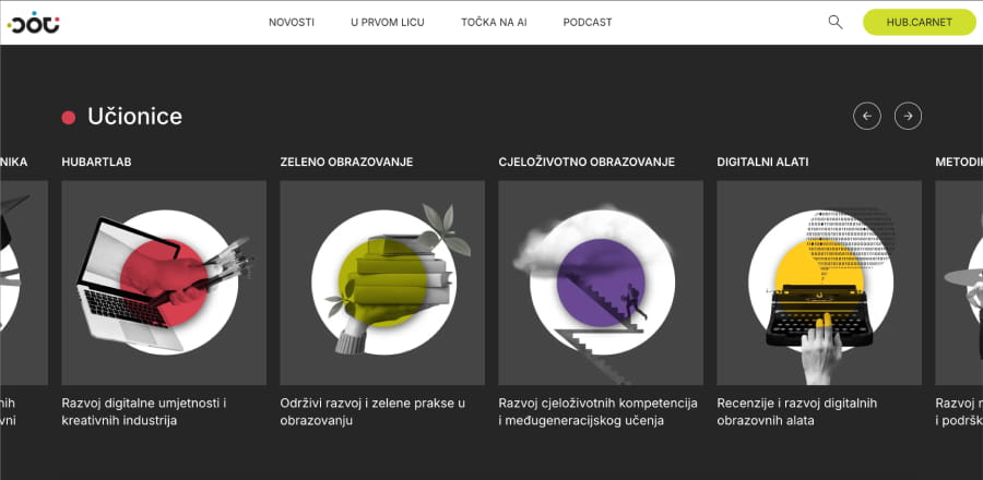
“ The visual style is based on a clean editorial structure, complemented by illustrations, colour and graphic details that bring dynamism and give each section its own character.
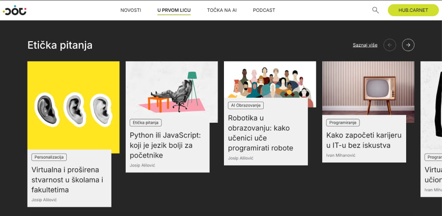
The system was designed modularly, using reusable cards and content blocks across different pages.
This ensured visual consistency while providing enough flexibility to accommodate different content formats — from articles and news to educational content and podcasts.
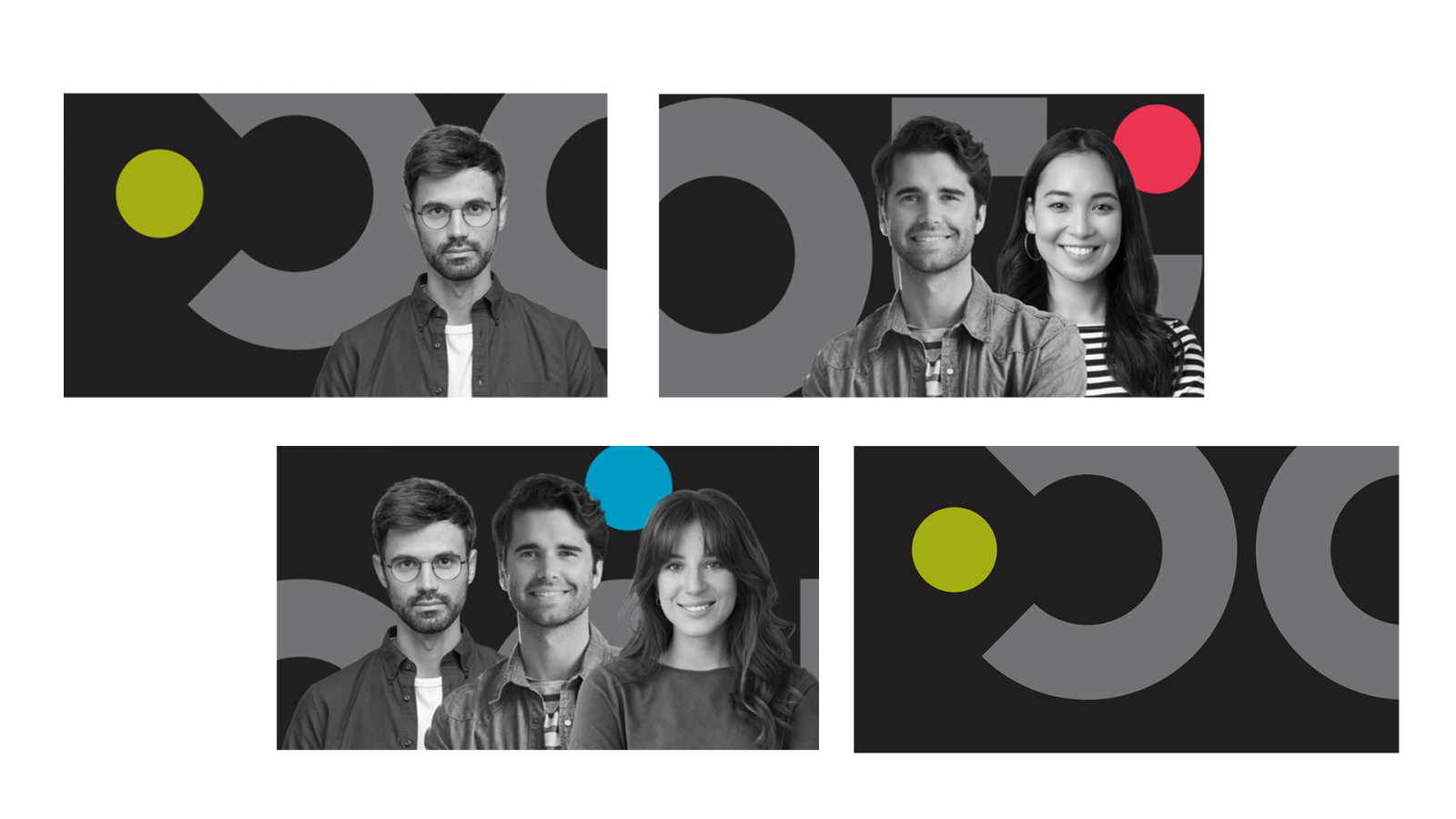
For the podcast section, we developed a distinct visual approach and adaptable cover templates.
The UI Style Guide established the typography, colour palette, grid and component system, creating a foundation for the future development of the portal and other e-Universities websites.
Implementation and development
Implementation and development
Following the design phase, the portal was developed in a WordPress environment, with a focus on straightforward content management and flexibility for future upgrades.
The technical implementation included integration with CARNET’s authentication system, multilingual support, SEO settings, analytics, content management and migration of the existing sys.portal website.
Accessibility
From the outset, the portal was developed in line with high accessibility and security standards.
Accessibility features include screen reader support, contrast adjustments, font size controls and the option to enable a dyslexia-friendly font, all implemented in accordance with digital accessibility guidelines and security requirements.
Personalisation
The system was developed to be modular and flexible, allowing the editorial team to easily adapt content, manage different types of publications and continue developing the portal without disrupting its core structure.