EWPC Split
Client
Croatian Water Polo Federation
What
Branding and design
Deliverables
Concept, Graphic Design, Web Design, Development
About
As a result of our long-term cooperation with the Croatian Water Polo Federation, we were tasked to create the visual identity, logo and website for 35th LEN European Water Polo Championships that will take place in Croatia, Split.
The unbreakable bond between the Mediterranean and water polo
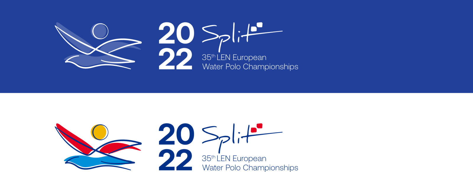
When it comes to water polo, Croatia has a rich history of winning trophies in all major competitions. The interesting fact is that the first water polo game in Croatia was played in Split, back in 1908. More than 100 years later, Split will host one of the biggest water polo championships. In the process of designing and creating the logo and visual identity for this event, we were inspired by three recognizable symbols of Split: the blue Adriatic Sea, the golden sun and a seagull flying above the city and enjoying the amazing view.
“ In the process of designing and creating the logo and visual identity for this event, we were inspired by three symbols of Split: the blue Adriatic Sea, the golden sun and a seagull flying above the city and enjoying the amazing view.
The passion that exceeds the lines
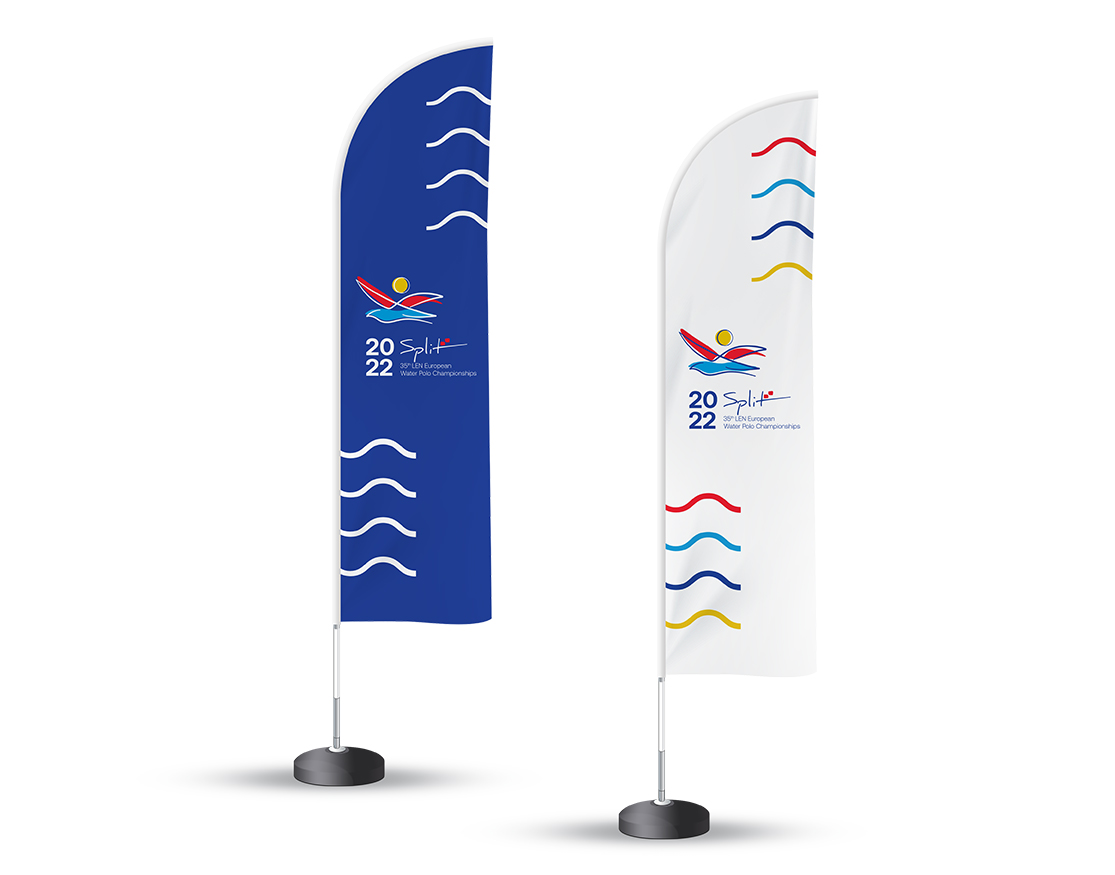
Based on the three symbols of Split we created the main elements of the sign. The Adriatic Sea represents the pool, the sun became a water polo ball and the seagull was transformed
into a water polo player rising above the water to score a goal. Combining the main elements together, we created a sign that portrays both championship location and water polo as a passionate and exciting sport.
“ Combining the main elements together we created a sign that portrays both championship location and water polo as a passionate and exciting sport.
Colors and composition
Fiery red color, bright yellow and sea blue are vibrant and appealing primary colors which are infusing liveliness and vitality to the sign. The main elements were additionally highlighted with the dark blue color that accentuates the deep roots of water polo in Croatia.
As the primary typographic solution, we chose the Raleway font. This simple, sans-serif font is suitable for print and web, and at the same time its simplicity allows the sign to fully stand out.
A wave that keeps moving
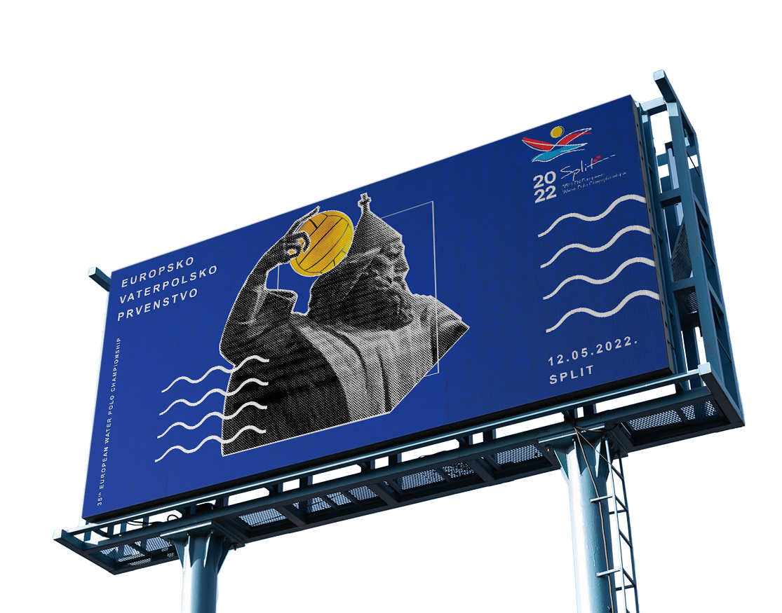
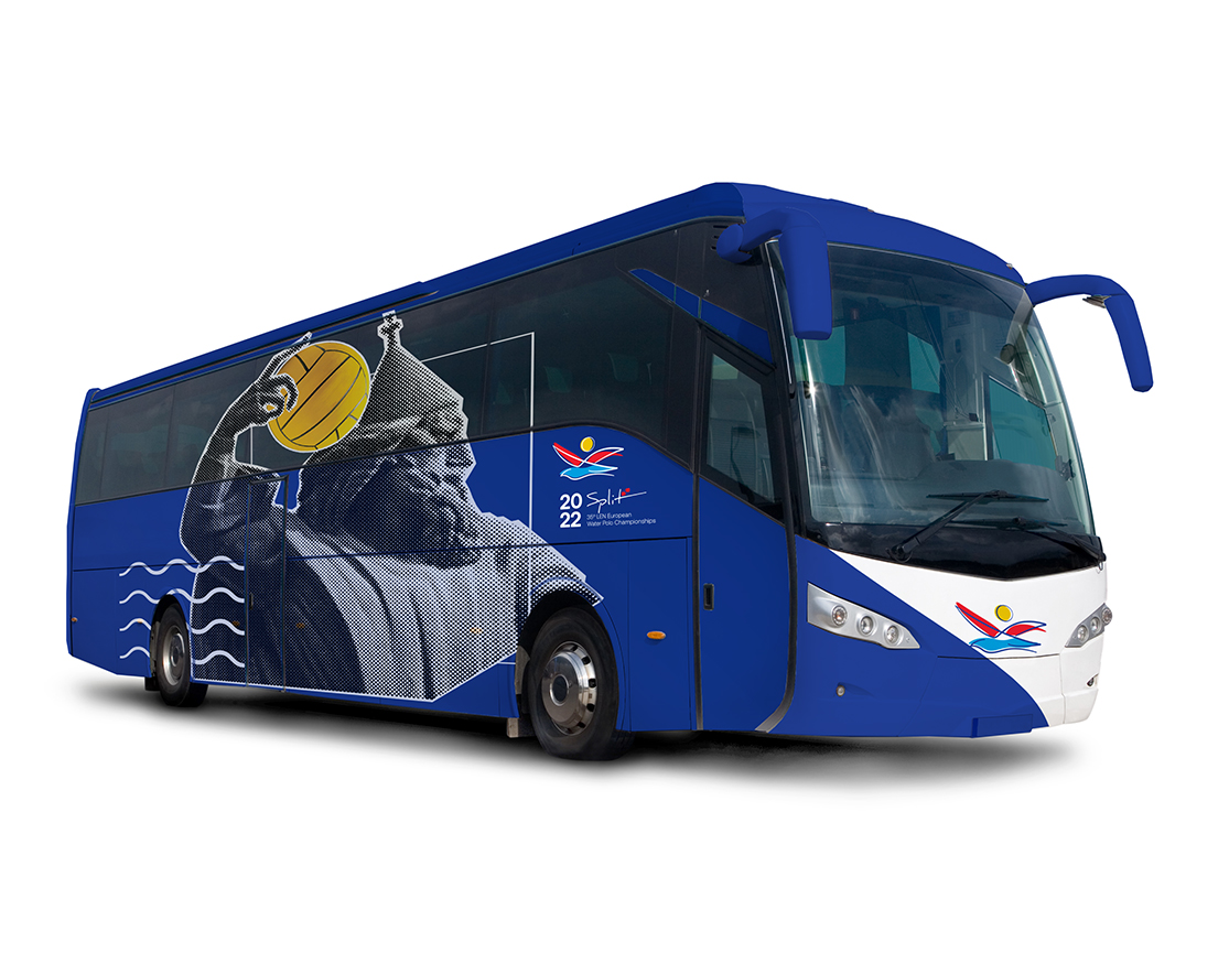
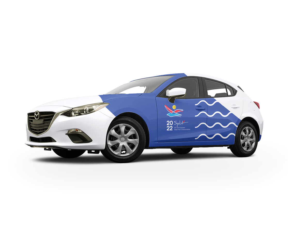
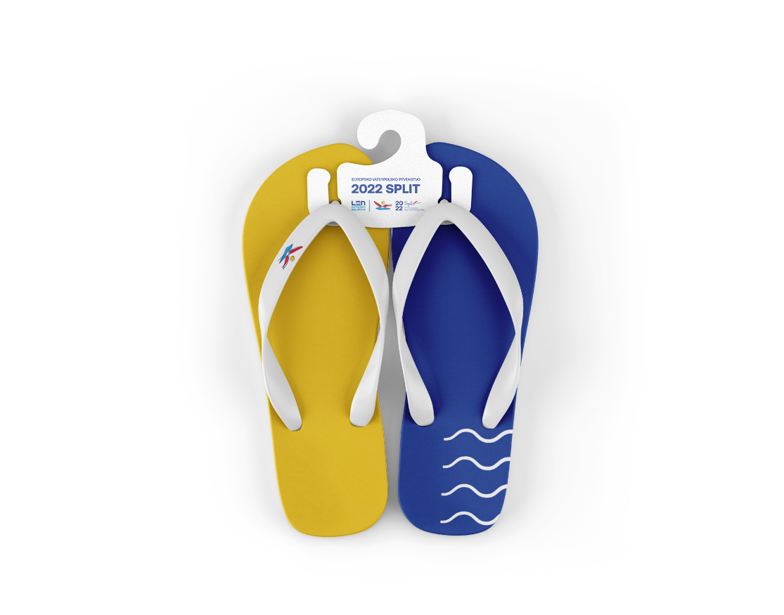
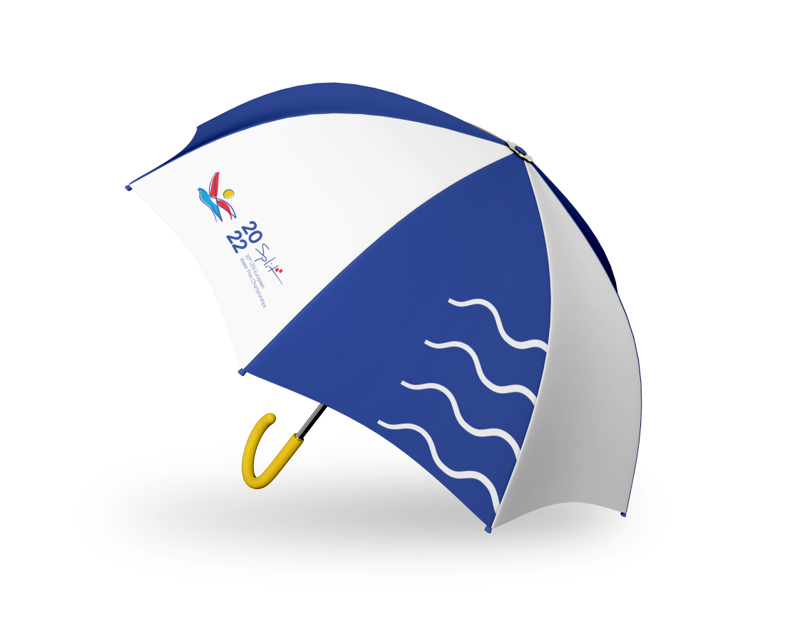
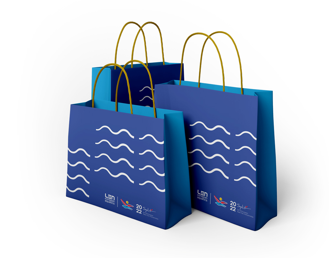
When the wave of inspiration hit us while creating this design concept, we decided to use the real wave as the secondary visual element. Combining the waves in the primary brand colors we created an effective and exciting element.
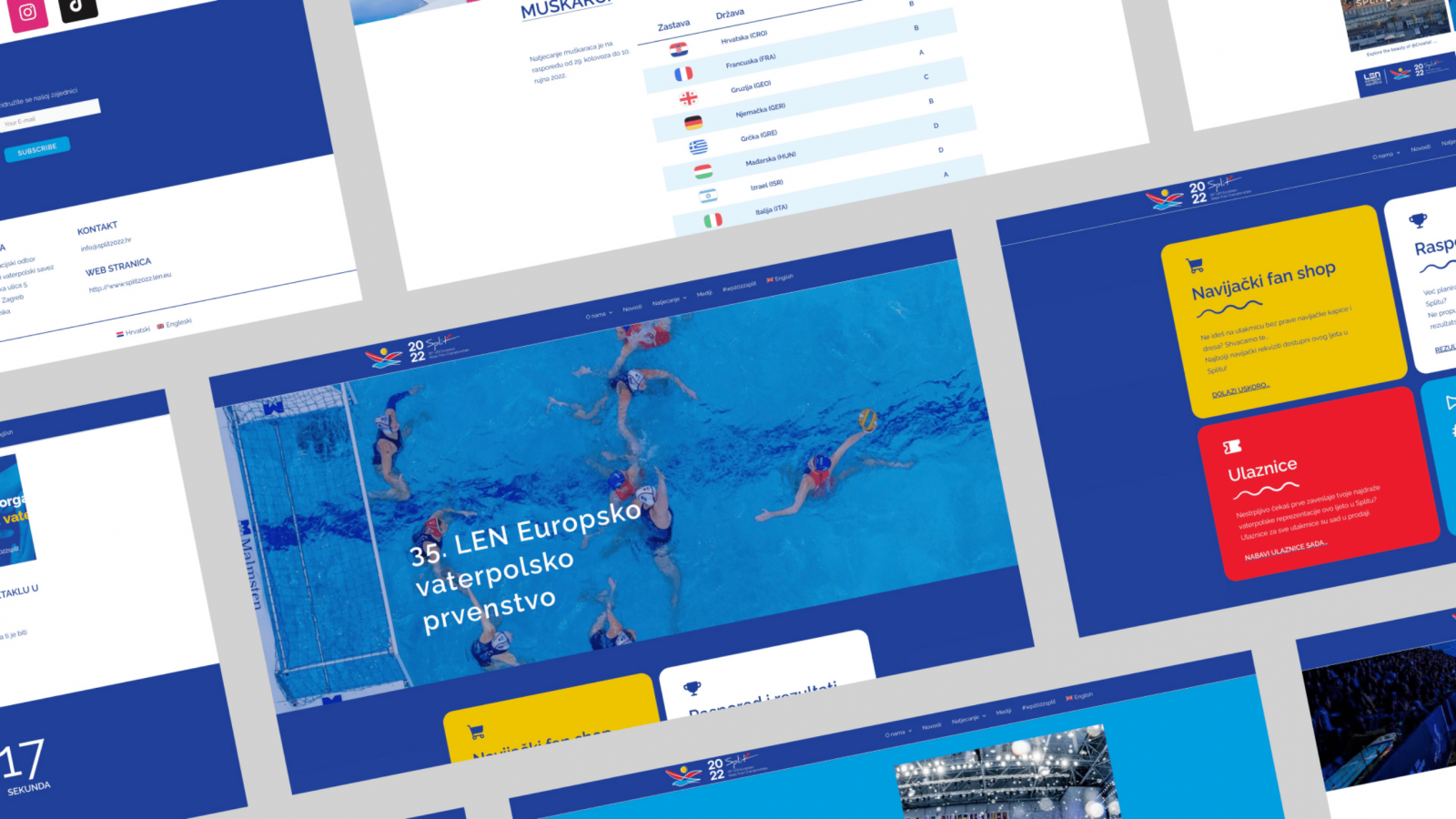
The waves were so cool that they became the main visual motive on the championship website. We have developed a simple, user-friendly web that provides all relevant information about the competition, game schedule, tickets and merchandise. By implementing the main colors in the web design we kept the simplicity, while sea blue and white content blocks provide additional clarity.
