About the project
Redesign of the Croatia's biggest Finance Agency proved that findability precedes usability.
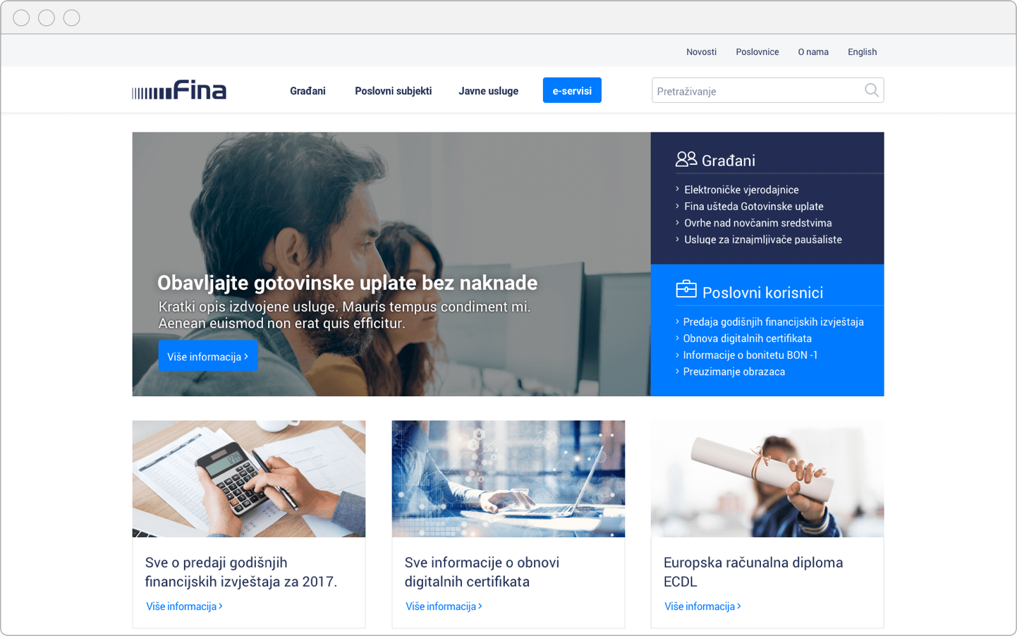
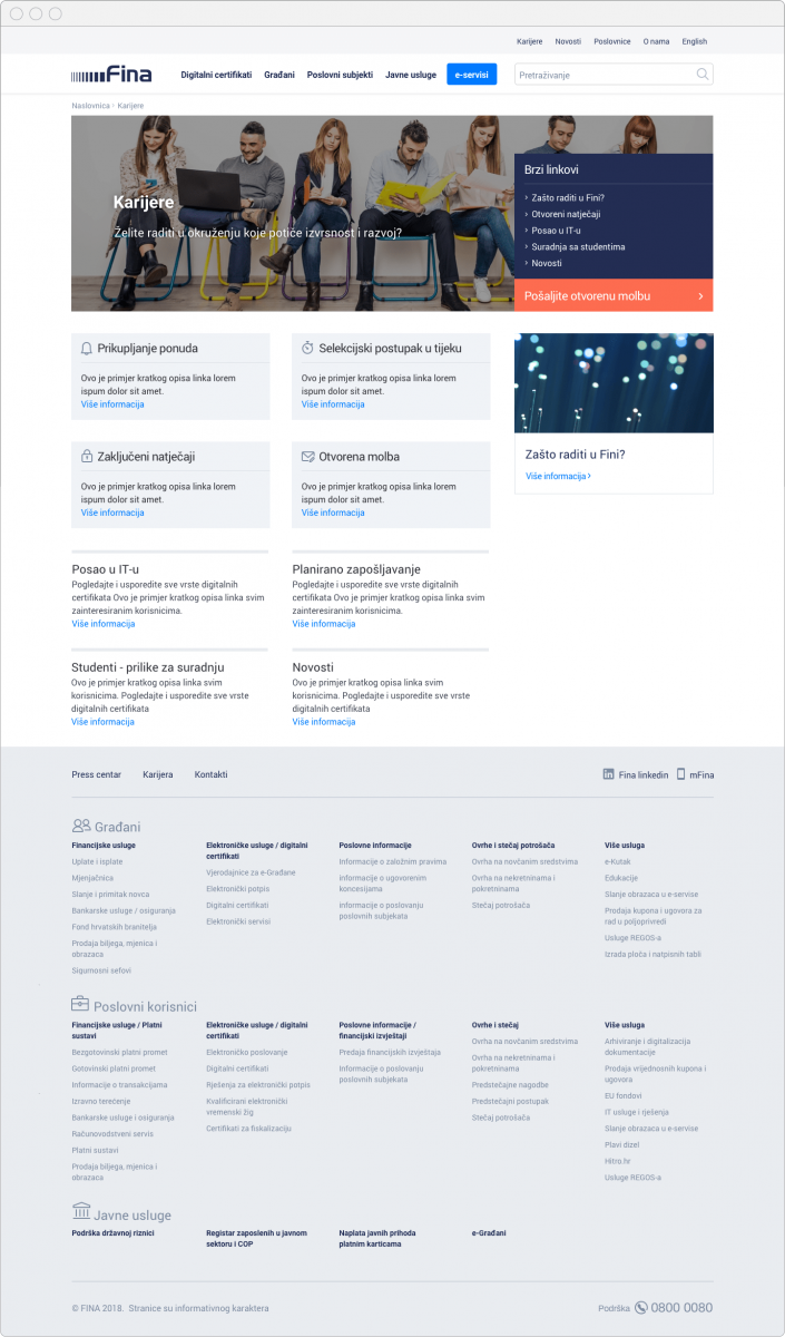
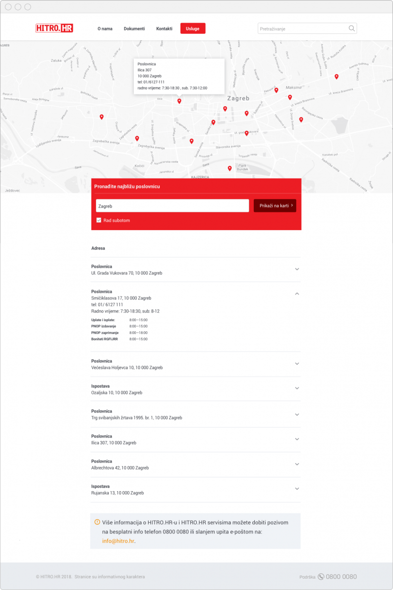
Leading Croatian provider of financial and electronic services FINA tasked us with redesign of their website. The goal was to improve user experience, drive engagement and improve communication with its users.
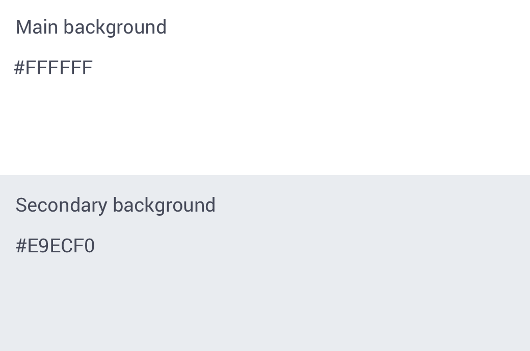
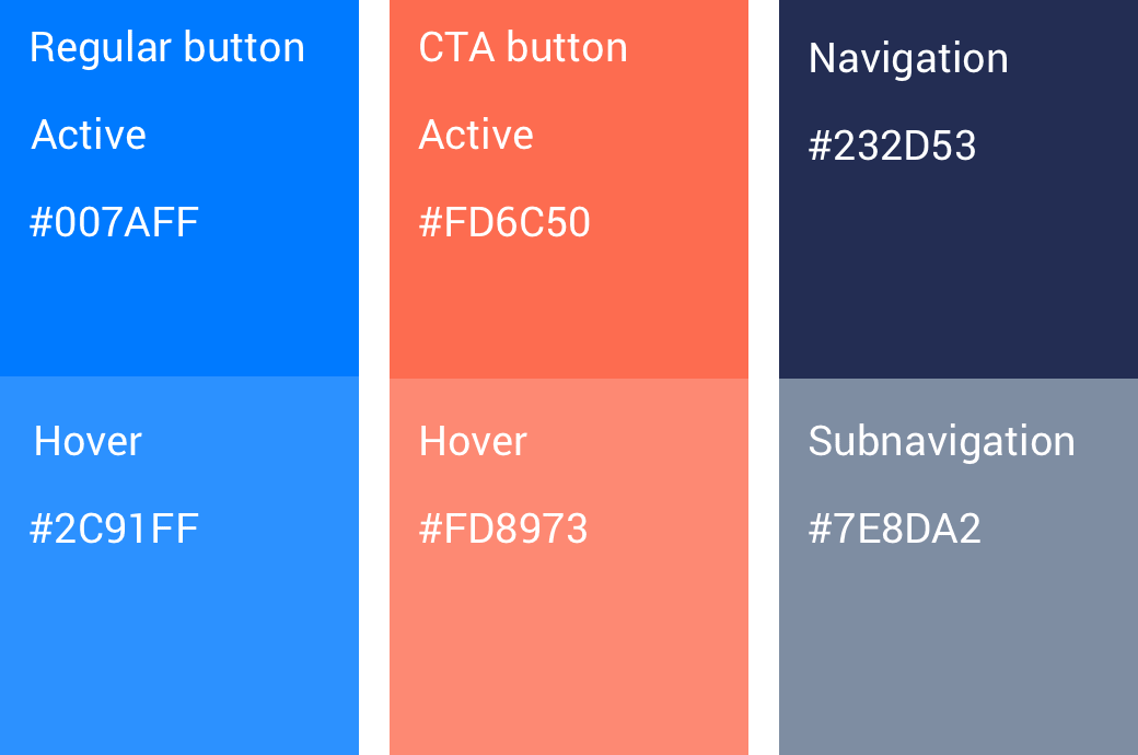
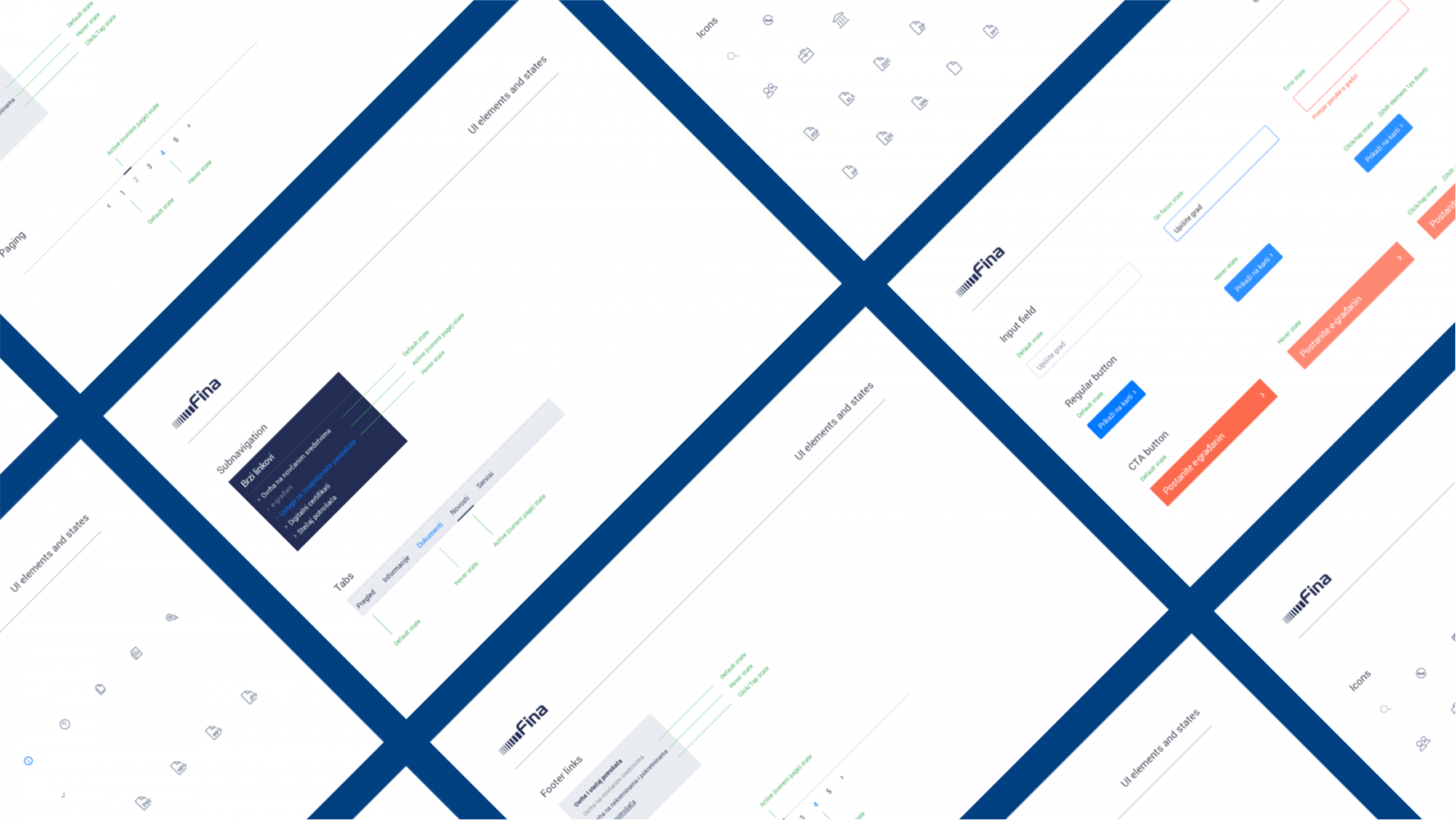
We reimagined the website with clear information architecture, future-proof layout and clear design system that supports next products. We’ve made it clear how to write content and results.
“ You can’t use what you can’t find.
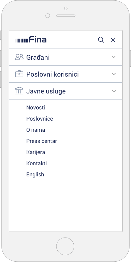
Information Architecture
Good information architecture makes users less alienated and suppressed by technology. It simultaneously increases human satisfaction and company’s profits. To identify exact pain-points & understand terminology we’ve stripped down existing sitemap and tree tested it, asking users to tell us where they would search for exact items, using defined scenarios as tasks.
“ Good information architecture makes users less alienated and suppressed by technology.
We’ve created new routes and explored their effectiveness in second round of testing, basing our decisions on real data. Previous mess, made by years and years of adding content without strategy and structure, was cleared, and results showed us that findability significantly improved.
User could now easily find the information they needed because we’ve shifted approach, dividing services by contexts and users, instead of their type.
Improving the User Experience
To understand our users, and cross reference their goals with FINA's scope and goals, we've done extensive research and set up measurable goals, tasks & scenarios.
We ran multiple surveys with citizens, business users and FINA’s staff to identify pain-points of the customer journey. We took call centre transcripts to see what are the most asked questions, ran a workshop with FINA’s staff and did interviews with different stakeholders.
“ Most of the time I guide users on the website to show them where they can find manuals for using digital certificates.
Differentiating users and setting contexts
Business users have decent level of technical knowledge, while regular citizens often lack it. Even though they could find the needed information, they didn’t understand it due to language and way it was written. Thus, it was extremely important to create guidelines on how to write for web – using plain language, summaries and SEO friendly layouts.
Contexts
People interact with FINA in different situations and we’ve used them to create contexts. With this, we could easily foresee when and what information will users need, and set up small links on each page providing easy access to other important information.
• time (yearly reports in winter, renewing certificates in spring etc…)
• situations (foreclosure, opening a business etc…)
• user type(SME, citizen etc..)
Scenarios
We’ve identified different users, and created a matrix to create scenarios:
• user (who uses the product)
• narrative (what does it use it for)
• goal (why does it use it for)
Migration and content
On of the biggest challenges was migration of old, messed content to a new layout and new information architecture. To ensure positive user experience, we've introduced new concepts and solutions.
Static URL pages for documents
As FINA publishes lot of documents, manuals and legal procedures, it’s super important that all content is up-to-date. They are now on single, static URL, providing easy access without questions “Is this the right document?”
Versioning
As legal boundaries change and evolve, old documents become obsolete. With versioning, we’ve provided easy way to stay in track, and keep an archive that is always accessible.
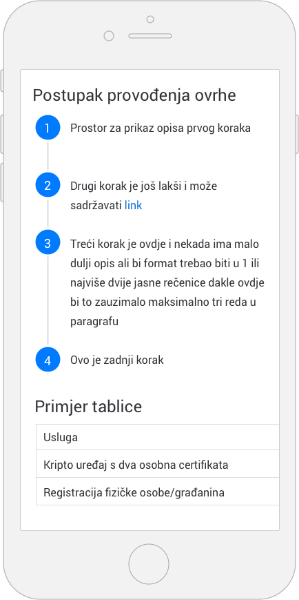
Writing guidelines
Interaction with websites start on search engines – that's why we insisted on creating guidelines on writing for web. With proper formatting and easy summaries that can be scanned quickly, SEO drastically improves and users find information faster.
“ I'm doing online payments with my business and i need a digital certificate. How much does it cost and how to get it?
Before
“Svi obveznici fiskalizacije dužni su radi provedbe fiskalizacije u prometu gotovinom nabaviti produkcijski aplikacijski certifikat koji se u postupku fiskalizacije koristi za elektroničko potpisivanje elemenata računa te za identifikaciju obveznika fiskalizacije prilikom elektroničke razmjene podataka.”
After
“Ako ste obveznik fiskalizacije, morate nabaviti digitalni certifikat (CA) u registracijskim uredima Fine.
On vrijedi 5 godina i cijena mu je jednokratno 375kn s PDV-om. Potrebno ga je obnoviti prije isteka roka, inače se plaća oporavak, tj. obnova certifikata.
Saznajte kako preuzeti, instalirati i koristiti certifikate, te detaljne cijene i novosti oko zakonskih okvira i tehnoloških rješenja.”
